Showing posts with label Review. Show all posts
Showing posts with label Review. Show all posts
Tuesday, 22 November 2016

Saturday, 3 September 2016
The iWatch… Apple Watch… Watch Edition…
...you know, those really geeky Apple devices on people's wrists that are totally the rave right now
by Paul Ekwere
___________________________

I've been away for quite a while. It's literally been a year since my first post and about seven months since my
last.
To be fair, I have spent a lot of that time
playing with the Apple Watch. I blame the Apple Watch for my irregular blogging
schedule.
That's my excuse and I'm sticking to it!
Jokes aside, it is a pretty good device.
It’s a very convenient device to have on you at the right time but to be fair, I do think it
has its fair share of niggles.
The Apple Watch comes in a couple of sizes, 38mm for people
with relatively smaller wrists and who do not like large watches, and the 42mm
variant.
I got a 42mm Gold version (it’s really just gold-plated Aluminium). I
won’t say for how much but it did cost a pretty penny! (Note-to-self: blog more
often to get free review units!)
There is also a limited edition apple watch
which for the life of me I can’t tell why anyone would buy. Apple refers to it
as the ‘Watch
Edition’. Not sure why.

And for an £8,000 to £13,500 price tag, even
with an 18 carat gold case, no thank you. Don’t care! (unless it’s a free
review unit, thank you very much!)
The Watch Edition looks, smells and feels
like a standard 38mm or 42mm Apple Watch!
Without further ado,
let’s get right into it shall we!
Out the box, the apple watch comes shipped
with all the standard accoutrements you’d expect to see. Magnetic inductive
charger with an extra-long cable, portable charger head and an extra strap to
allow for adjusting for wrist size.


Synchronisation and setup is also a fairly straightforward affair. It really is as simple as following the instructions. (Too bad for the many of us who do not ever read instructions!)
The
good
The User Experience: The user interface is
very beautifully designed it's very simple to use and the crown button on the
side, though initially a source of contention among many technophiles, works
perfectly! The apps tend to work quite well particularly with apps like Spotify
and GoPro that are designed to work as a remote control.

Accessories - The straps: The Apple Watch
comes with a fair number of accessories that can be used for different
scenarios. Primarily, the straps are interchangeable for easy customization. I
find this particularly useful as though I have the Sport version, there are
times when I’d rather be wearing a more comfortable leather strap on my wrist.
I’ve currently amassed as many as four straps for my Apple Watch. (I just can’t
help myself!)
Fair play to Apple, allowing for such customization
only makes the Apple Watch a more appealing device as it is less boring to wear
a watch that always looks the same.

One thing I’ll give apple for their design
is that the straps fit very comfortably. In fact, I dare say, better than any
other watch I’ve worn. I should know… I do like my watches!

Accessories – Customisation: In addition to
the straps, Apple has designed quite a few watch faces for the Apple Watch and
quite a few of them as well you can customise even further to look very simple
or give it a touch of class. From the old school skeuomorphism-inspired
chronograph look, to the more fitting digital look, my personal favourite is Mickey tapping his foot in
sync with the passing seconds. Gotta love ol' Mickey!

If you’re one of the pedantic few worried about
scratches on your Apple Watch, you can also purchase wrap-around protective
cases to protect the watch face.
Battery life: The apple watch battery usually
lasts a full day of regular use. I use it for all of my major activities
including on average an hour to two of active sports. Regardless, I don't have
to worry about charging until I get home and I put it back on my deskside
charging stand.
A lot of early entrants to the smart watch market seemed to
have a significant problem with battery life.
Fitness tracking: The Apple Watch is
arguably one of the best fitness trackers there is it right now. Yes, there are
a
few arguably comparable smart watches and pretty
good fitness trackers out there that could attempt to rival the Apple Watch,
but putting all other things together, and considering the full package of what
the Apple Watch has to offer, it definitely beats the competition hands down!
Heart rate monitor: The apple watch comes
equipped with a very capable heart rate monitor which to be fair is not a first
for fitness tracking devices. It is a very useful add-on for fitness tracking
and although may not work perfectly under all conditions, credit to Apple, it
has reportedly been proven to be a literal life-saving feature.

Siri, Notifications and quick replies: Siri
is nothing new, and using Siri on the Apple Watch isn’t a much different
experience than using it on the iPhone.
A short press-and-hold of the ‘crown’ button on the side of the iWatch
and Siri is at your beck and call.

Not having to take your phone out of your pocket
for every single notification has easily proven to be a personal time-saver for
me. It has personally kept me a lot more organized over the last couple of
months. Be it for messages, news apps, navigation or phone calls, having an
Apple Watch has definitely helped improve the level of interaction I have with
my phone, particularly enabling me to quickly weed out the unnecessary.
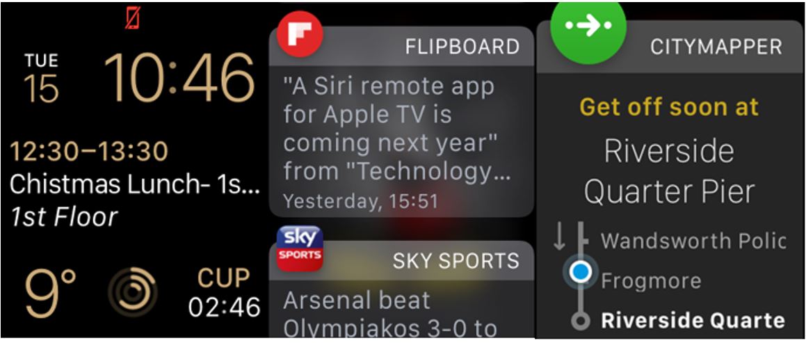
I can very easily view notifications from
my phone without having to remove my watch from my pocket. This is very
convenient in very many instances. One of the really cool things I also
discovered is that even though you don't have a physical keyboard you can use
voice dictation which is actually exactly how I am writing this blog post.

Apple
Pay: Apple Pay is Apples answer to Google’s Google pay. (I know, they even
sound similar). It is Apple’s proprietary payment platform that enables you
make contactless payments using your Apple Watch or your iPhone.
This is very convenient and has personally
made all of my (numerous) London Underground trips a lot less of a hassle.
Apple Pay of course only works if you have pre-registered your card details on
the device.
It is worth noting also that not all banks
support Apple Pay, so before you get all excited and purchase the iWatch solely
for this feature, check that your bank actually supports Apple Pay first.
The
bad
The User Experience – specifically, speed &
random errors: The Apple Watch can be unusually slow sometimes. This has a lot
to do with the operating system currently installed on it. The Apple Watch OS
3 release in June 2016 came with considerable speed improvements for the Apple
Watch.
There are however, further improvements
that could be made.
Synchronisation speed: iWatch apps are not
stored directly on the watch. The watch merely acts as a conduit or smart
controller of sorts. This is accomplished via a Bluetooth link between the
iWatch and your iPhone. The Apple Watch Bluetooth connection to the iPhone
tends to lead to a significant degree of latency when attempting to launch
applications directly on the apple watch. In general, it frankly gets slow!
& the majority of your time is spent watching this….

Errors: In my personal experience, every now
and then when attempting to launch an application from the Apple Watch it simply
falters and tends to return some truly confounding error messages. The Instagram
app is a recurring culprit. It simply does not ever do what it should!

Battery life: The Apple Watch batteries are
only really good for a day and when I say for a day as earlier mentioned I
actually do mean for a day of regular use. For a very active person who does a
lot of fitness tracking (say 4 hours and above per day), the heart rate monitor
tracks continuously when using the ‘Workout’ app. This usually leads to
significant battery drain.
Fitness tracking: Other than the obvious
battery drain that I mentioned above when the heart rate monitor is continuously monitoring your heart rate, there is also an additional issue where the heart
rate monitor does not work very well in cold weather. The detail on what causes
this problem is
GPS (or the absence thereof): Yup! The Apple Watch does not
have GPS! That really sucks! I'm into fitness I like running and I don't like
having to take my phone with me all the time. To be able to track the pace of
your run properly, you currently need to have the iPhone your Apple Watch is
paired to on you while you run.

Notifications and quick replies: The Apple
Watch is great for notifications. Quick replies though are somewhat limited in
range. The tend to be the standard messages you see on your iPhone when you
attempt to ignore a call. Messages like “Can’t talk right now”, “In a meeting”,
“Busy, will call you back”. Voice dictation and quick replies are good but not
perfect and once you tap on one of them, there's no way to cancel. That message is pretty much sent. If you’re going to use either, expect hilarious results!

It's arguably the best approach not to attempt to use either in a professional setting.
Watch faces: we need more watch faces
choice selection is very limited. Enough said!
Cell connectivity: The Apple Watch connects
to your phone via Bluetooth and as such answering phone calls via the speaker
on the Apple Watch is just the same as using a Bluetooth headset. As such one
cannot wear the Apple Watch independently with say just an android phone on
them and be able to receive calls on it. There are days when I want to put my
work phone (the iPhone) down and go about my business with just my One Plus 2 and my Apple Watch. Unfortunately,
that is currently not possible.
Apple
Watch 2 - What’s new? (what to expect & what not to expect)
Cell connectivity: With the Apple Watch 2,
don't hold your breath about cell connectivity. It is very likely that the Apple
Watch 2 will still be dependent on the iPhone. This is unlikely to change any
time soon given Apple’s design philosophy of working with an ecosystem design
model which obviously keeps, you the consumer, tied-in and buying co-dependent
Apple products. It has however been recently reported by the Wall Street
Journal that Apple plans to include cell connectivity in the new Apple Watch
design. A
claim that other trusted reviewers in the know have very quickly refuted!
GPS: It's rumoured that next week's release
of the Apple Watch 2 will give us the much needed GPS upgrade required to make
the Apple Watch a decent standalone fitness device. Nike
seems to have inadvertently leaked a hint towards this with their most recent
Nike+ Run Club app update. It’s left for us to wait with baited breath and
hope that they actually did include GPS in the Apple Watch 2.
New accessories: As with most new Apple
device releases it is much expected that Apple will release new accessories for
the Apple Watch some of them would be expected to be the standard watch straps
which are interchangeable in new different designs and exciting colours. The
really good thing about this is that now you will have more options for your
existing Apple Watch as for those who do not upgrade the straps should still be
able to fit either the Apple Watch one on the Apple Watch 2
Improved battery: Yes, there are rumours
about a much improved Apple
Watch battery in a certain leaked takedown seen this week that Apple
has made the Apple Watch 2 screen considerably thinner to accommodate the
bigger battery. This adds fuel to the fire with the rumour that the Apple Watch
2 will indeed have GPS. If the rumours are true, this would be a massive improvement, especially with
regard to the battery drain when doing fitness tracking as well.
For now, I guess we can
only wait and keep our ears peeled for next week's
announcement from Apple!
I'm
really excited for the Apple Watch 2. Primarily for one thing, that long overdue addition of GPS!
What are your thoughts on the Apple Watch and the Apple Watch 2? Let us know your thoughts, feel free to leave a comment below!
What are your thoughts on the Apple Watch and the Apple Watch 2? Let us know your thoughts, feel free to leave a comment below!
If
you found this #TechforTheTechie review useful and want to learn more on general techie stuff and general gadgety wizardry, you can also find me on:
-
Saturday, 20 February 2016
The Showdown: Siri | Google | Cortana
#TechforTheTechie: Machine Learning and Natural Language Processing
by Paul Ekwere
_________________________
Being a general tech geek and a fan of all things data and
analytics, I woke up this morning and in my spare time started learning
something on sentiment analytics.
Sentiment Analysis in
the words of a certain Mr Seth Grimes, is a set of methods, typically (but
not always) implemented in computer software, that detect, measure, report, and
exploit attitudes, opinions, and emotions in online, social, and enterprise
information sources. (As an aside, what makes it “analysis” is that you’re
doing it systematically, with some goal in mind.)
The reason why I’m all over this right now is because I have
a little pet project I'm working on which has to do with analysing my Twitter
data but that's beside the point of why I decided to post this actually.
So here's the thing, being a massive Arsenal fan as well
(& given my generally short attention span), while deeply embroiled in my
research on the logic of deep learning, Twitter APIs and php coding, a random
thought popped into my head "I wonder what time the Arsenal game is on
today?"
So I decided in the spirit of the moment, what with my
mind... well, half my mind still on machine learning, natural language
processing and all I decided to run a little (absolutely non-scientific) test to see who does natural language
processing better.
Siri (Apple), Google or Microsoft’s very own Cortana.

Very handy for me that I had an iPhone, an android
...scratch that the android phone of the year the OnePlus 2, and a Microsoft
Surface on hand.
So here's what happened.
Click on the link
to hear what actually transpired (I actually recorded this). The results are
quite interesting.
Spoiler alert, not at all what you'd expect! There's a bit of a surprise at the end as well.

There’s another
recording here, just because I'm a massive fan of Cortana (& I know
you are too). A word of warning: spoilers! You need to have listened to the
first recording before this!
And in case that hyperlink doesn’t work, here’s the link to
the second recording.
Okay, my work here is done…. Off to watch that Arsenal game
now!
Follow @paul_ekwereii
Tweet to @paul_ekwereii
Saturday, 1 August 2015
Windows 10 First Look - Surface Pro Edition
The New Windows 10 UI - My thoughts from first use (in 24 hours or less)
by Paul Ekwere
__________________________________
There's a popular saying that to whom much is given much is expected. A lot has been said and done to usher in the new Windows 10 operating system and the media kept our expectations very very high indeed in the months leading up to its global launch on 29th July, 2015. As one of the early adopters I was very excited to get this piece of software on my Microsoft Surface Pro.
It was all I could do to keep myself from bursting with excitement during the download and installation of the new Windows 10 OS on my device. I simply could not keep my hands off of my Surface Pro during the download process.
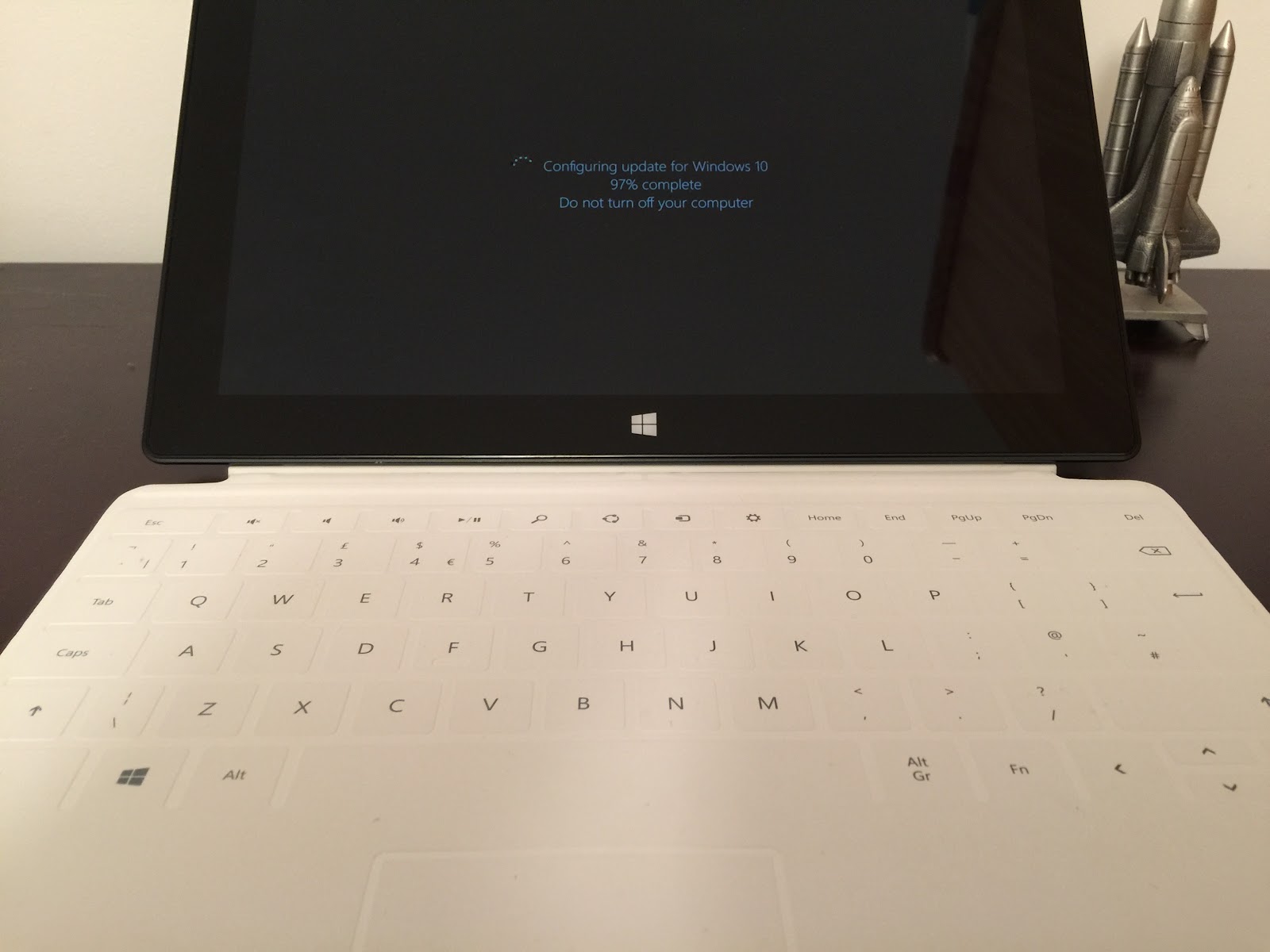 |
| Notification should have read, "Calm down... I know you're excited... Windows 10 will be all yours shortly!" |
Without further ado, let's launch right into it shall we.
So what's all this fuss about Cortana?
Cortana is an intelligent personal assistant created by Microsoft for Windows Phone 8.1, Microsoft Band, Windows 10, and soon to be released on iOS, Android and Xbox One.
 |
| The familiar face of Cortana |
Cortana is not necessarily new and in fact is a well known character in the world of gaming. The Windows 10 personal assistant is named after Cortana, an AI character in the popular video game series, Halo by Microsoft.
The excessive hype prior to the launch of Cortana on the windows desktop environment led me to expect a lot more from the desktop PA version of Cortana.
So far I have only been able to make Cortana do the most simple tasks. The more complex ‘asks’ tend to leave Cortana with no more options than to do a web search.
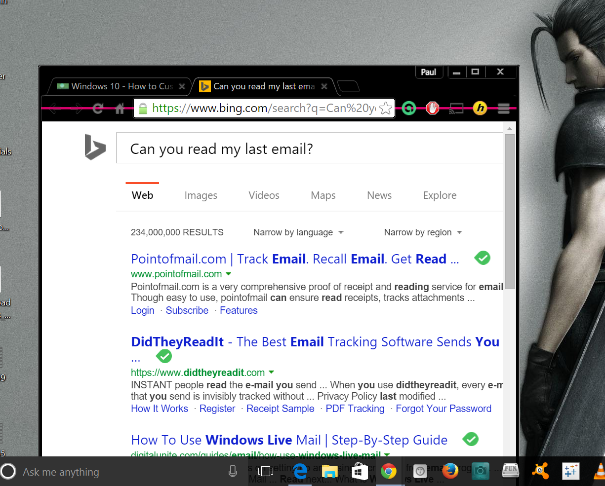 |
| Siri easily nails this request |
Cortana is however good for a couple of things.
Tasks such as setting reminders, creating calendar entries, and sending emails are easily executed by Cortana once dictated, albeit not in as fluid a manner as would be expected. There are yet a few niggles here and there that need to be ironed out.
A few things you can do with Cortana and how they compare with her closest rival - Siri:
1. Cortana will tell you the weather forecast - Siri already does that.
As with Siri (and in fact Google now), natural language queries such as, "Hey Cortana, Do I need an umbrella tomorrow?", tend to evoke a fairly natural sounding response with a quick summary of the weather conditions to expect for the day in question.
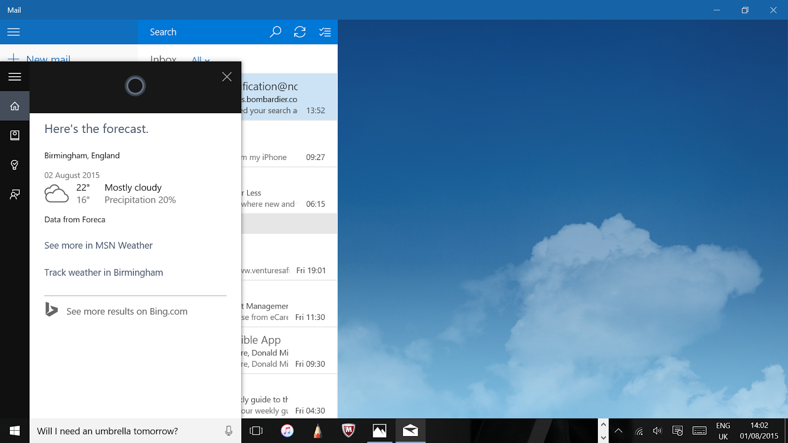 |
| Checking weather forecasts seems to be a fairly simple task for Cortana |
2. Cortana will set reminders for you when asked to.
Be warned, this may end up being a very painful process where you have to manually edit every reminder after Cortana's attempt to translate your requests to written text.
Siri does this as well - albeit a bit smoother than Cortana with the speech recognition)
3. Cortana tells jokes!
What’s the one thing we all want in a personal assistant? Yep. A sense of humour! Microsoft have managed to endow Cortana with a somewhat dry sense of humour but a good enough one that she does come up with the occasional nerdy math joke!
 |
| Cortana comes up with some pretty good one-liners when asked to |
Unfortunately, she just can’t quite keep up with the wit that is Siri and fails miserably at some of the classic Siri banter, resorting to a web search when she does not understand your statement.
 |
Refer to Siri as Cortana and vice versa or ask both Siri and Cortana witty questions like “How much wood would a woodchuck chuck if a wood chuck could chuck wood?” and wait for the response
|
4. Cortana will switch from tablet mode to desktop mode and vice versa - Siri doesn't do that (frankly Siri doesn't need to do that)
For all the pomp and pageantry that preceded it, Cortana is definitely a let down. Don't get me wrong, I like Cortana! Cortana brings a different level of flexibility and ease of use to the windows PC.
It is however unfortunate and disappointing that the much touted 'AI personal assistant like no other' is just an other (not very impressive) piece of software.
On the whole it feels like Siri has been reverse engineered to give you Cortana. (Not a claim I wouldn't level at Apple as well with regard to the development of Siri and possible 'reverse engineering' of other already existing AI personal assistant software at the time, but that's another story. Let's focus on Windows 10 here shall we).
The user interface on Windows 10 is quite different from how it was in Windows 8. The 'Start' button has been reintroduced due to the rousing outcry from users when it was removed in Windows 8. The old tiled 'Metro' environment has been replaced with something called 'Tablet mode'. The 'tiled' styling of apps is however retained in tablet mode albeit slightly redesigned.
These tiled apps are also accessible in the desktop quick menu when by clicking the 'Start' button.
Switching between tablet mode and desktop mode on the Surface Pro has been fairly straightforward. This can be done simply by selected the required option via the new notification panel accessible in the menu bar at the bottom-right of the screen.
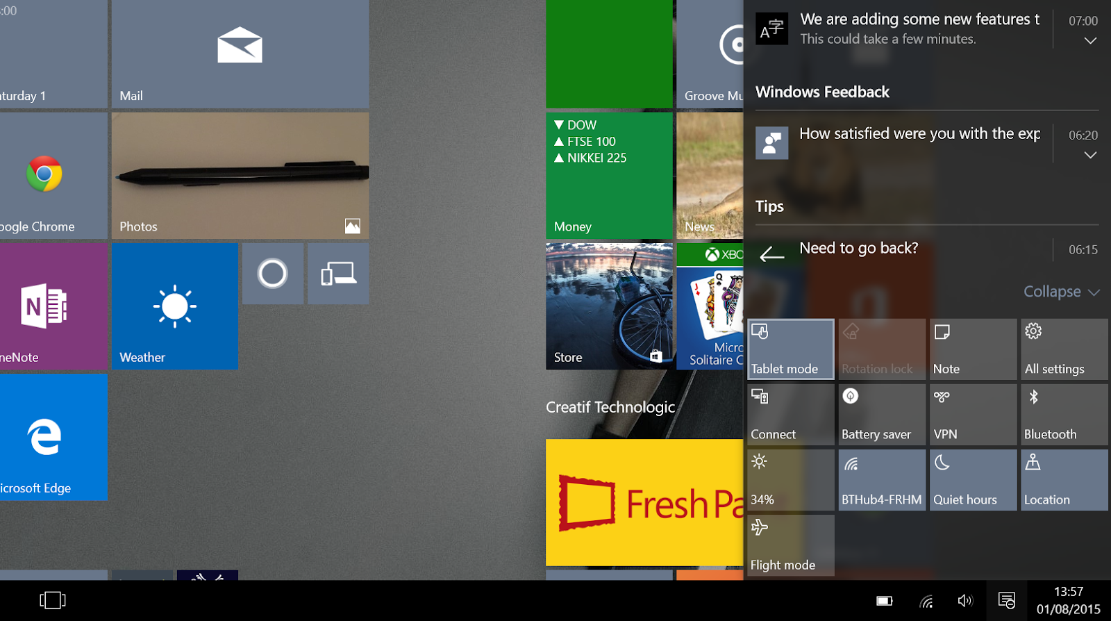 |
| Accessing the notification pane in Windows 10 is fairly straightforward |
There is also an option to allow Windows 10 to automatically detect and switch when you want to use which mode i.e. auto switching to tablet mode once the detachable keyboard is removed.
As earlier mentioned, I found that a neat trick you can use is to simply tell Cortana to do it for you whenever. Simply uttering the words, "Hey Cortana, switch to tablet mode!" works a charm.
Microsoft has also introduced true multitasking in Windows 10. Apps that were strictly for the tiled metro UI which did not run in the background when you switch to desktop mode, now run seamlessly regardless of which mode you are in. This is a very good step towards unifying the user experience across the new Windows 10 OS and one area where I'd say there is a marked improvement from the ‘Windows 8 feel' of things.
As earlier mentioned, I found that a neat trick you can use is to simply tell Cortana to do it for you whenever. Simply uttering the words, "Hey Cortana, switch to tablet mode!" works a charm.
Microsoft has also introduced true multitasking in Windows 10. Apps that were strictly for the tiled metro UI which did not run in the background when you switch to desktop mode, now run seamlessly regardless of which mode you are in. This is a very good step towards unifying the user experience across the new Windows 10 OS and one area where I'd say there is a marked improvement from the ‘Windows 8 feel' of things.
The new Edge browser is a bit of a funny one.
I haven't used it that much but my first few attempts however yielded ridiculously hilarious results. On launching Edge, you are given the bog-standard introductory slideshow as with most software applications and an option to import your 'favourites' or bookmarked pages from your legacy browsers.
I promptly imported my few favourites from Internet explorer and literally the first link I clicked on did not work!
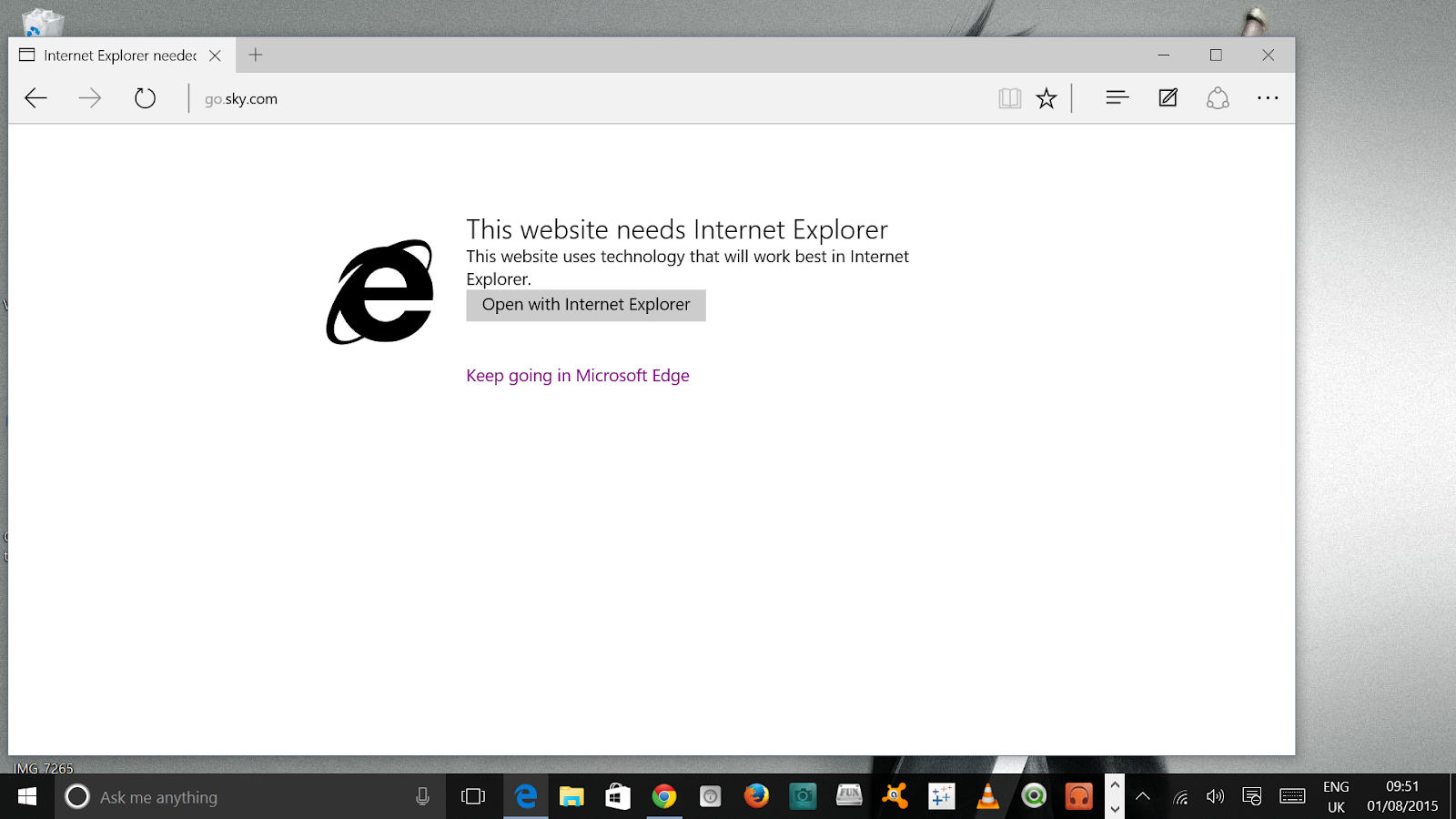 |
| "Well this is disappointing!” |
Microsoft has made Edge the default browser option and all Cortana's searches regardless of whether you change your default browser or not will still be run on Bing - Microsoft's search engine.
It seems to me that the developers out there at Microsoft still need a bit more time to unify compatibility of certain basic web pages with the Edge browser.
In this case I am wont to believe that the limitation here is on Edge's ability (or inability as the case may be) to utilize Silverlight dependent media content.
It seems to me that the developers out there at Microsoft still need a bit more time to unify compatibility of certain basic web pages with the Edge browser.
In this case I am wont to believe that the limitation here is on Edge's ability (or inability as the case may be) to utilize Silverlight dependent media content.
The Edge browser has some other niggles which are likely to be fixed in later releases and software upgrades.
For those who became big fans of Microsoft's offering of free cloud storage in OneDrive, Windows 10 I'm afraid comes with some disappointing changes as to how OneDrive works. OneDrive has quickly become intrinsic to how Microsoft systems are used especially since the introduction of Windows 8 and Office 2013.
On the Windows 8 OS, Office 365 users had quick access to their over 1TB worth of free storage easily from the OneDrive application. Interestingly, with Windows10, Microsoft has taken a slightly different approach to the way OneDrive works.
There's no separate application for OneDrive but rather it is tied into the back end system.
The one major drawback with this is that you have to choose the OneDrive folders to sync to your computer. To access all other OneDrive content, OneDrive has to be accessed via a web page. Syncing all your OneDrive folders for quick access leaves you with synced folders on your OneDrive take up storage space on your PC. In the case where you have a solid state drive which does not have very much space (say anything between 64GB - 250GB), you will find that this will effectively reduce the amount of free disc space available on your C: drive. This is very similar to how Google Drive files sync on PCs (and in fact the primary reason why I stopped using Google Drive and initially moved to OneDrive on Windows 8).
This is definitely a step backwards and there has been a massive kickback from the tech community already.
On the Windows 8 OS, Office 365 users had quick access to their over 1TB worth of free storage easily from the OneDrive application. Interestingly, with Windows10, Microsoft has taken a slightly different approach to the way OneDrive works.
There's no separate application for OneDrive but rather it is tied into the back end system.
The one major drawback with this is that you have to choose the OneDrive folders to sync to your computer. To access all other OneDrive content, OneDrive has to be accessed via a web page. Syncing all your OneDrive folders for quick access leaves you with synced folders on your OneDrive take up storage space on your PC. In the case where you have a solid state drive which does not have very much space (say anything between 64GB - 250GB), you will find that this will effectively reduce the amount of free disc space available on your C: drive. This is very similar to how Google Drive files sync on PCs (and in fact the primary reason why I stopped using Google Drive and initially moved to OneDrive on Windows 8).
This is definitely a step backwards and there has been a massive kickback from the tech community already.
The new Windows 10 home screen in the tablet mode UI leaves quite a bit to be desired.
I liked the tiles in Windows 8 and how they all snapped nicely together.
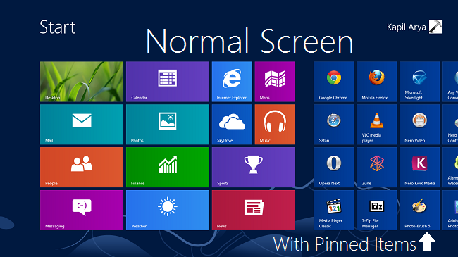 |
| The Windows 8 metro UI Image Credit: Jason Muro vs… |
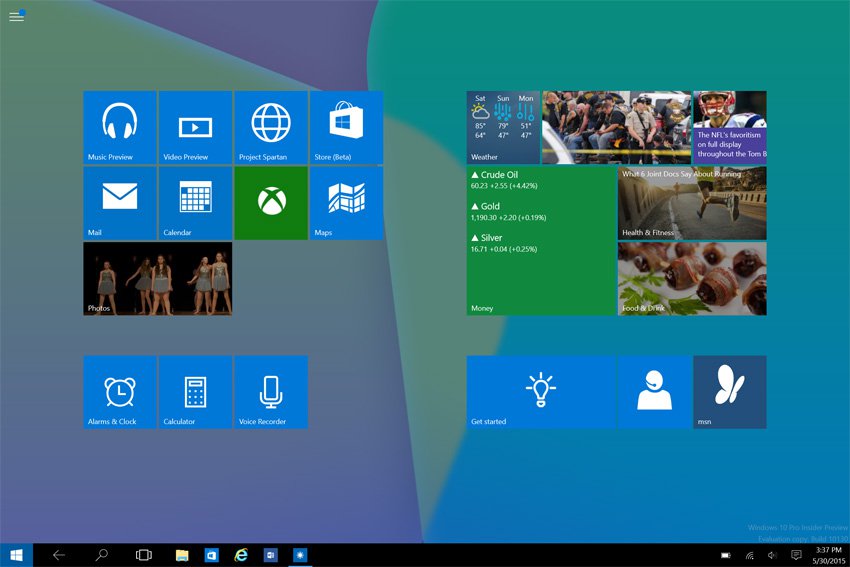 |
| Windows 10 in tablet mode on the Surface Pro: Image Credit: Paul Thurrott |
The bland new look with the smaller tiles / app icons in the Windows 10 tablet mode will definitely take some getting used to.
It is still possible to resize the app icons and make tiles 'wide' if that is preferable.
The app icons or tiles as well no longer snap or rearrange neatly when moved around like they did in Windows 8. Resizing a tile back to 'medium' leaves a 'medium' sized gap where the rest of the wide tile used to be.
The app icons or tiles as well no longer snap or rearrange neatly when moved around like they did in Windows 8. Resizing a tile back to 'medium' leaves a 'medium' sized gap where the rest of the wide tile used to be.
 |
| A bit more tedious customisation required for the metro interface or tablet mode in Windows 10 than in Windows 8 |
I take it the general redesign of icons or tiles was needed to allow a certain size range of icons (or tiles if you will) to be scalable and fit nicely on a wide variety of screen sizes. A positive approach for those (few) heavily invested in the windows ecosystem who use a windows phone and lumia devices as well as a PC, or cross over device like the Surface Pro.
I understand that Microsoft was trying to go as far away from the old look as possible but they just might have ended up alienating people who became accustomed to the new look Windows 8.
My first 24 hours of using the new Windows 10 interface on the surface pro has by no means been a fully extensive review of all that Windows 10 has to offer. It has however, left me with quite an indifferent feeling from a bit of a bland user experience.
For the seasoned Windows 8 user, there really does not seem to be very much that is 'special' about it on the surface (pun unintended).
I guess time will tell with this one, I just might start to like it given a bit more time than 24 hours!
I may be one of the few that really did like Windows 8! (well... actually, Windows 8.1), and overall I think I am feeling a sense of nostalgia for the Windows 8 OS.
I'm not sure why I feel this way but there is a good takeaway point here for Microsoft & their UI designers & developers --- 'New' should be just that, 'New'. It should 'feel' new, not refurbished. It should evoke feelings in me that make me want to use it more.
Ultimately it shouldn't make me miss what it was supposed to be a replacement for.
I know, I know, "Stop whining and roll-back the updates already!" Right?...right?... Wrong!
I'm a stickler for progress and improvement in everything! Everything! And although there are some aspects of the new windows 10 OS that currently do not 'sit well' with me - apparent security issues not being the least of my concerns, I'll trust that this is the beginning of something great for Microsoft --- the ushering in of a new era if you will. Innovation always comes with its teething problems, and in many cases, you need a proof of concept to properly evaluate the pros and the cons (did someone say Surface RT?...LOL).
In my opinion (quite the spin doctor, I know), I'll close with these words - Microsoft have proved with the Surface Pro, the reintroduction of the Start button to Windows 10 and other key changes that "You CAN teach an old dog new tricks".
Microsoft has historically shown resilience, and an attention to what the customer wants. This ability to adapt and innovate will be key ingredients going forward that will shape the course of future versions of and ultimately help chart the success of Windows 10.
__________________________________
My first 24 hours of using the new Windows 10 interface on the surface pro has by no means been a fully extensive review of all that Windows 10 has to offer. It has however, left me with quite an indifferent feeling from a bit of a bland user experience.
For the seasoned Windows 8 user, there really does not seem to be very much that is 'special' about it on the surface (pun unintended).
I guess time will tell with this one, I just might start to like it given a bit more time than 24 hours!
I may be one of the few that really did like Windows 8! (well... actually, Windows 8.1), and overall I think I am feeling a sense of nostalgia for the Windows 8 OS.
I'm not sure why I feel this way but there is a good takeaway point here for Microsoft & their UI designers & developers --- 'New' should be just that, 'New'. It should 'feel' new, not refurbished. It should evoke feelings in me that make me want to use it more.
Ultimately it shouldn't make me miss what it was supposed to be a replacement for.
I know, I know, "Stop whining and roll-back the updates already!" Right?...right?... Wrong!
I'm a stickler for progress and improvement in everything! Everything! And although there are some aspects of the new windows 10 OS that currently do not 'sit well' with me - apparent security issues not being the least of my concerns, I'll trust that this is the beginning of something great for Microsoft --- the ushering in of a new era if you will. Innovation always comes with its teething problems, and in many cases, you need a proof of concept to properly evaluate the pros and the cons (did someone say Surface RT?...LOL).
In my opinion (quite the spin doctor, I know), I'll close with these words - Microsoft have proved with the Surface Pro, the reintroduction of the Start button to Windows 10 and other key changes that "You CAN teach an old dog new tricks".
Microsoft has historically shown resilience, and an attention to what the customer wants. This ability to adapt and innovate will be key ingredients going forward that will shape the course of future versions of and ultimately help chart the success of Windows 10.
__________________________________
What's your #windows10 experience been like so far?
Please share in the comments below.Author's mini-Bio: Paul is an aerospace design engineer, tech enthusiast, data geek and micro-blogger (among other things). Follow him on Twitter at @paul_ekwereii
Disclaimer: The content of this post are my opinion and not necessarily that of any organization I may be professionally affiliated with. Please exercise discretion when quoting. Follow @paul_ekwereii Tweet to @paul_ekwereii
Subscribe to:
Posts (Atom)